
| 일 | 월 | 화 | 수 | 목 | 금 | 토 |
|---|---|---|---|---|---|---|
| 1 | 2 | 3 | 4 | 5 | ||
| 6 | 7 | 8 | 9 | 10 | 11 | 12 |
| 13 | 14 | 15 | 16 | 17 | 18 | 19 |
| 20 | 21 | 22 | 23 | 24 | 25 | 26 |
| 27 | 28 | 29 | 30 |
- 리액트 훅
- 프로그래머스
- 리액트
- codesandbox
- 컴퓨터 네트워크
- 코딩테스트 고득점 Kit 완전탐색
- 디자인 패턴
- 코틀린
- react hook
- react
- 자바 공부
- useState
- useEffect
- 장고
- 코딩테스트 고득점 Kit
- websocket
- vanillaJS
- React JS
- 프로그래밍 언어론
- 자바스크립트
- 백준
- NextJS
- design pattern
- 프로그래머스 완전탐색
- Java
- 자바
- react firebase
- JavaScript
- 프로그래머스 자바
- 데이터모델링과마이닝
- Today
- Total
기록하는 개발자
[React] react-select를 사용해보자 본문

현재 만들고 있는 프로젝트는 가게 직원의 스케줄 및 출근부를 관리하는 웹 페이지이다.
각 가게마다 같은 이름의 직원이 등록될 수 있다고 간주하고 이름과 색상을 함께 조합하여 구분한다.
(즉, 이름과 색까지 모두 같을 수는 없음)
이에 스케줄 및 출근부의 작성과 수정 시 직원을 선택할 때 색도 함께 보여주어야만 하는데
이미 위와 같이 select, option 태그로 구현을 해놓은 뒤에야 문제점을 발견하게 되어 뒤늦게 리팩토링을 하게 되었다.
select 태그에 색을 넣기 위해서는 div 태그로 직접 select를 구현하거나 라이브러리를 사용해야했다.
직접 구현하는 것이 빠르기는 하지만 react-select 라이브러리를 경험해보고 싶어서 적용해보았다.
설치
- react-select 와 chroma-js를 함께 사용하였다.
// npm
npm i react-select

// yarn
yarn add react-select

// typescript(chroma-js)
npm i --save @types/chroma-js
employeeSelectType.ts
- type 선언
import { ActionMeta, SingleValue } from "react-select";

export interface optionObj {
  label: string;
  color: string;
  isDisabled?: boolean;
}

export interface employeeSelect {
  optionList: optionObj[];
  onChangeEmployee: (
    newValue: SingleValue<optionObj>,
    actionMeta: ActionMeta<optionObj>
  ) => void;
  defaultValueIndex?: number;
}
EmployeeSelect.tsx
import Select, { StylesConfig } from "react-select";
import chroma from "chroma-js";
import * as employeeSelectType from "../../commonType/employeeSelectType";

const EmployeeSelect = ({
  defaultValueIndex,
  optionList,
  onChangeEmployee,
}: employeeSelectType.employeeSelect) => {

// 선택 후 이름 앞에 색과 함께 보여줄 점
  const dot = (color = "transparent") => ({
    alignItems: "center",
    display: "flex",
    ":before": {
      backgroundColor: color,
      borderRadius: 8,
      content: '" "',
      display: "block",
      marginRight: 8,
      height: 15,
      width: 15,
    },
  });

  const colorStyles: StylesConfig<employeeSelectType.optionObj> = {
    control: (styles) => ({
      ...styles,
      backgroundColor: "white",
      boxShadow: "none",
      borderRadius: "10px",
      borderColor: "gray",
    }),
    option: (styles, { data, isDisabled, isSelected }) => {
      const color = chroma(data.color);
      return {
        ...styles,
        backgroundColor: `${color.alpha(0.2)}`,
        color: "black",
        cursor: isDisabled ? "not-allowed" : "default",

        ":active": {
          ...styles[":active"],
          backgroundColor: !isDisabled
            ? isSelected
              ? data.color
              : color.alpha(0.2).css()
            : "white",
        },
      };
    },
    input: (styles) => ({ ...styles, ...dot() }),
    placeholder: (styles) => ({ ...styles, ...dot("white") }),
    singleValue: (styles, { data }) => ({ ...styles, ...dot(data.color) }),
  };

  return (
    <Select
      defaultValue={
        defaultValueIndex ? optionList[defaultValueIndex] : undefined
      }
      key={defaultValueIndex ? defaultValueIndex : 0}
      options={optionList}
      styles={colorStyles}
      placeholder={defaultValueIndex ? undefined : "직원선택"}
      isMulti={false}
      onChange={onChangeEmployee}
      components={{
        IndicatorSeparator: () => null,
      }}
    />
  );
};

export default EmployeeSelect;
defaultValue : defaultValue를 두고 싶은 경우, key 값까지 함께 넣어주어야 적용이 된다.
isMulti : true로 설정하는 경우 한 번에 여러 option을 선택할 수 있게 된다.
IndicatorSeparator : null로 설정해주는 경우 아래와 같이 우측에 세로 구분선이 사라진다.

UpdateSchedule.tsx
import 생략

import * as employeeSelectType from "../../commonType/employeeSelectType";
import { ActionMeta, SingleValue } from "react-select";

const UpdateSchedule = ({...}: type.updateScheduleProps) => {
  ...

  useEffect(() => {
    let list: Array<employeeSelectType.optionObj> = [];

    list.push({
      label: "직원선택",
      color: "gray",
      isDisabled: true,
    });
    employeeList.map((item, i) => {
      if (Number(employeeId) == item.id) setDefaultValueIndex(i + 1);
      list.push({
        label: item.name,
        color: `#${
          enumType.enumColor[item.color as keyof typeof enumType.enumColor]
        }`,
      });
    });
    setOptionList(list);
  }, [employeeList]);

    const onChangeEmployee = (
      newValue: SingleValue<employeeSelectType.optionObj>,
      actionMeta: ActionMeta<employeeSelectType.optionObj>
    ) => {
      let employeeId = 0;
      let employee = "";

      if (employeeList && newValue) {
        for (let i = 0; i < employeeList.length; i++) {
          const color = `#${
            enumType.enumColor[
              employeeList[i].color as keyof typeof enumType.enumColor
            ]
          }`;

        if (employeeList[i].name == newValue.label && color == newValue.color) {
          employeeId = employeeList[i].id;
          employee = employeeList[i].name;
          break;
        }
      }
      setEmployee(employee);
      setEmployeeId(employeeId.toString());
    }
  };


  return ( ... );
};

export default UpdateSchedule;
EmployeeSelect에 parameter로 전달할 optionList 생성
- 앞선 employeeSelectType.ts 에서 선언한 optionObj type에 맞춰 list를 구성한다.
- 작성과 달리 수정에는 기존에 선택되었던 직원의 이름이 defaultValue로 보여야하므로 defaultValueIndex 도 저장했다.
useEffect(() => {
    let list: Array<employeeSelectType.optionObj> = [];

    list.push({
      label: "직원선택",
      color: "gray",
      isDisabled: true,
    });
    employeeList.map((item, i) => {
      if (Number(employeeId) == item.id) setDefaultValueIndex(i + 1);
      list.push({
        label: item.name,
        color: `#${
          enumType.enumColor[item.color as keyof typeof enumType.enumColor]
        }`,
      });
    });
    setOptionList(list);
  }, [employeeList]);
onChangeEmployee()
import { ActionMeta, SingleValue } from "react-select";

const onChangeEmployee = (
    newValue: SingleValue<employeeSelectType.optionObj>,
    actionMeta: ActionMeta<employeeSelectType.optionObj>
  ) => {
    let employeeId = 0;
    let employee = "";

    if (employeeList && newValue) {
      for (let i = 0; i < employeeList.length; i++) {
        const color = `#${
          enumType.enumColor[
            employeeList[i].color as keyof typeof enumType.enumColor
          ]
        }`;

        if (employeeList[i].name == newValue.label && color == newValue.color) {
          employeeId = employeeList[i].id;
          employee = employeeList[i].name;
          break;
        }
      }
      setEmployee(employee);
      setEmployeeId(employeeId.toString());
    }
  };
나는 name과 color를 조합 후 매치되는 id를 저장해야해서 코드가 길어졌는데 사실상 선택된 값을 가져오는 것은 정말 간단하다.
아래처럼 newValue(변수명 아무렇게나) : SingleValue<본인이 선언한 type> 을 함수의 parameter로 두면 newValue.label 과 같이 바로 값에 접근할 수 있다.
import { ActionMeta, SingleValue } from "react-select";

const onChangeEmployee = (
    newValue: SingleValue<employeeSelectType.optionObj>,
    actionMeta: ActionMeta<employeeSelectType.optionObj>
  ) => {
    const name = newValue.label;
    const color = newValue.color;
}
EmployeeSelect component 사용 코드
import * as type from "../type";
import EmployeeSelect from "../../../components/common/EmployeeSelect";

const UpdateScheduleView = ({...}: type.updateScheduleViewProps) => {
  return (
    <div className="updateEmployeeView container">
      <h3>스케줄 수정</h3>
      <div className="CreateWorkCheck content">
        <p className="modal-employee">
          <span>직원</span>
          <EmployeeSelect
            defaultValueIndex={defaultValueIndex}
            optionList={optionList}
            onChangeEmployee={onChangeEmployee}
          ></EmployeeSelect>
        </p>
        ...
      </div>
    </div>
  );
};

export default UpdateScheduleView;
적용 후 화면
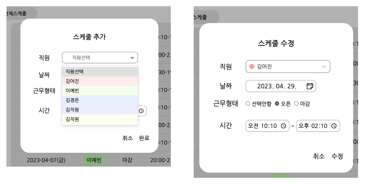
진짜...훨씬 귀엽다....🥹
참고
React-Select
A flexible and beautiful Select Input control for ReactJS with multiselect, autocomplete and ajax support.
jedwatson.github.io
https://codesandbox.io/s/qc3e2t?module=/example.tsx&file=/example.tsx
codesandboxer-example - CodeSandbox
A simple example deployed using react-codesandboxer
codesandbox.io
'Web > React' 카테고리의 다른 글
| [React] React에서 chartJs data label 추가하기 (0) | 2023.04.25 |
|---|---|
| [React] React+typescript에서 엑셀(csv)다운로드 구현 (0) | 2023.04.12 |
| [React] React+typescript에서 chartJs의 update() 사용법 (0) | 2023.04.07 |
| [React] axios interceptor를 이용한 token refresh (1) | 2023.04.07 |
| [React] 그래서 Next.js를 왜 써야하는데? (0) | 2022.12.19 |


